
International shipping is notoriously high-friction, involving complex HS Tariff codes, strict weight/dimension limits, and varying regional customs requirements. My goal was to transform this "legal chore" into a guided, error-proof digital experience that reduces parcel rejections and customer support overhead.
01. Preventative Validation & Logic
The Problem: Users often complete long forms only to find their parcel is ineligible at the final step.
The Solution: I implemented "Step 01 Validation." By capturing dimensions and weight immediately, the UI triggers real-time eligibility checks.
Impact: We prevent "dead-end" journeys by surfacing an "Unable to Send" state instantly if items exceed service limits, saving the user time and reducing backend processing of invalid orders.
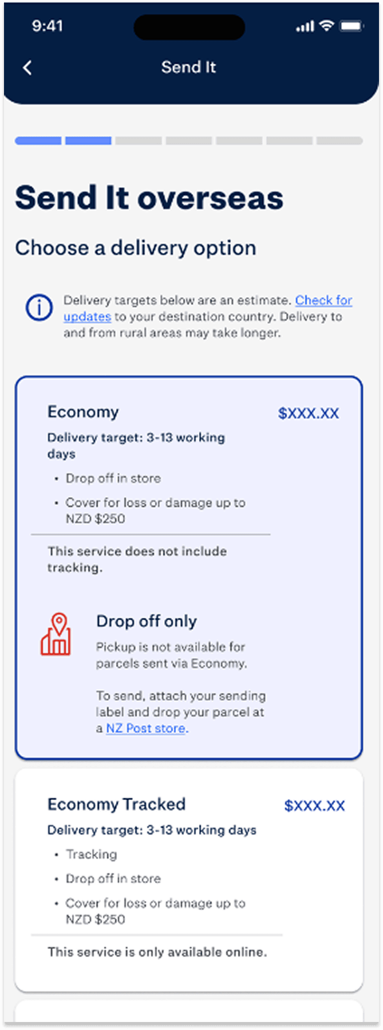
02. Service Transparency & Upselling
The Problem: Users struggle to understand the value difference between shipping tiers (Economy vs. Express).
The Solution: A tiered service architecture that balances price transparency with logistics requirements. I introduced contextual badges (e.g., "Drop-off only") and clear compensation toggles.
Impact: Improved user confidence in "value-for-money" decisions and a natural UX nudge toward tracked services.
04. Context-Aware Information Architecture
The Problem: International forms are long and intimidating.
The Solution: Dynamic Form Logic. The UI adapts based on the destination (e.g., showing US-specific State dropdowns or Tax ID fields only when relevant).
Impact: Reduced cognitive load by practicing strict Progressive Disclosure, ensuring users only see fields mandatory for their specific journey.
05. Operational Governance & Fulfillment
The Problem: The "digital-to-physical" gap—users often don't know what to do after paying.
The Solution: A unified Order Summary with inline editing to prevent drop-off, followed by a Post-Payment Roadmap.
Impact: Users leave the flow with a generated tracking number, a downloadable label, and a direct CTA to "Book a Pickup," ensuring the parcel enters the NZ Post network as fast as possible.
This project standardized the Figma architecture across five design teams at NZ Post. By implementing a status-driven design system, we ensured that every edge case, from "Invalid HS Code" to "Payment Timeout", was accounted for, resulting in a robust, scalable product that defines the future of digital postal services in New Zealand.
Research & Planning


Development & Implementation
The implementation focused on modularizing the item-entry flow within Step 4 of the tariff code forms. To reduce cognitive load, we transitioned from a batch-entry model to a guided, sequential process where users add items individually. Central to this architecture was the introduction of a summary card component, which solved the issue of excessive scrolling when managing multiple items. By working closely with UX writers, we overhauled the validation guidance, ensuring the complex tariff code selection felt intuitive rather than technical.
Testing & Optimization
Initial testing revealed that users struggled with high-density input fields, leading to errors in tariff classification. Our optimization phase targeted this friction by refining the interaction model in Maze and monitoring how the Figma-linked prototype handled itemized entries. By moving away from single-input batching and utilizing the summary card for quick review, we saw a significant increase in task completion speed and a reduction in user fatigue. This iterative loop ensured that even the 50+ demographic, who value clear, high-contrast guidance, could navigate the international shipping requirements without external assistance.
Streamlined International Itemization
The solution for Send It - INT centered on transforming a high-friction data entry task into a guided, manageable experience. We replaced the traditional, dense form factor with a modular itemization flow that allows users to add items individually rather than in a single, complex batch.
To resolve the issue of "infinite scrolling" during multi-item shipments, we implemented a persistent summary card. This component acts as a visual anchor, providing a high-level overview of added items and allowing users to review their progress without losing their place in the flow.
Sequential Item Entry
By breaking the tariff code process into individual steps, we significantly reduced cognitive load and input errors.
Guided Validation
In collaboration with UX writers, we replaced technical jargon with instructional microcopy, guiding users through the tariff selection process with clear, plain-language prompts.
The Summary Card:
This UI element streamlined the review process, providing a compact snapshot of the shipment and eliminating the need for long-form scrolling.
UX-Driven Logic
The shift from single-input batching to a "one-by-one" entry model ensured that each item was correctly categorized and validated before the user moved forward.


The launch of Send It - INT marked a critical milestone in modernizing the international shipping infrastructure. By replacing the legacy Drupal 6 "Print Postage Online" tool, we delivered a production-ready solution that immediately stabilized the international sending experience.
1. Seamless Replatforming & Deployment
We successfully transitioned the organization away from technical debt, launching a robust tool integrated directly into the core "Send a Parcel" ecosystem. The release was executed with high confidence, meeting the increasingly complex demands of global customs and international shipping regulations.
2. Immediate Market Validation
Upon release, the tool saw instantaneous user adoption. Real-world customers began generating international labels immediately, validating the end-to-end flow from address entry to tariff code selection and final label printing. This verified that our "guidance-first" UX approach successfully translated to a live, high-stakes environment.
3. Reduced Support & High Reliability
Early post-launch monitoring indicated that the tool "bedded in" with minimal friction. By solving the primary pain points identified in testing, specifically the cognitive load of tariff codes and multi-item scrolling, we delivered a self-service experience that reduces the need for manual customer intervention and support.
4. Future-Proofing Global Trade
Beyond the UI improvements, the project provides a scalable foundation for the "increasingly demanding customs landscape." The modular design allows for rapid updates to international regulations, ensuring the business remains agile as global shipping requirements evolve.