Booking flow + booking management UX UI
JUCY Web + Dashboard


A UX research (URX) study assessed the current site’s accessibility, usability, booking flow, and user dashboard for booking management. Key issues were found in navigation and task completion, with clear opportunities to improve engagement and conversion. Insights now guide the redesign strategy.
JUCY Campervans
Operating 3,000+ vehicles across 10 locations in NZ and Australia, the group includes JUCY (est. 2001) and Star RV (joined 2022). JUCY targets youthful, budget travellers, while Star RV offers a premium experience for 35+ inbound visitors seeking comfort and nature.
Timeline
Over six months, I uncover user needs through research and synthesis, turning insights into clear, actionable reports. I map intuitive wireframes and user flows to shape the experience. Finally, I deliver high-fidelity designs that are polished, consistent, and ready for development.
Background
The booking flow lacked flexible date selection, adding unnecessary decisions. Home navigation was confusing and cluttered with irrelevant content for NZ users. Content was dense and poorly organised, making over 70 pages hard to find without strategic filtering. Users couldn't compare vehicles easily, needing to swap pages. The site wasn’t responsive, with key CTAs missing on mobile. Finally, gaps in CX/UI left existing users without clear flows to manage or make multiple bookings.
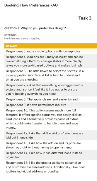
Discovery was led by UXR, combining website performance data, competitor analysis (including page loading times, content evaluation, and UI accessibility assessment), a preference study, card sorting exercises for home navigation and checkout journeys, as well as internal interviews with travellers and key call centre staff.
Research & Planning
Conducted research using multiple sources, including A/B testing with UXtweak, card sorting to optimize home page navigation, UI/UX competitor analysis, page conversion data, SEO team insights, and interviews with real customers and key business stakeholders to define audience segments and prioritize features. The entire process was documented in Asana to keep everyone involved and informed.


Development & Implementation
Features captured from research and wireframing were pragmatically applied to the Figma components and prototype, with component naming and design tokens defined in collaboration with front-end developers to ensure team alignment.
Testing & Optimization
Planned thorough cross-device testing and user feedback loops, but this phase was limited due to time constraints and leadership changes.
Tools
UXTweak/Google Analytics > Asana/Chat GTP > Whimsical/UIZard > Figma
The resulting online booking engine was improved and optimized, with a streamlined booking UX for faster, more efficient reservations. A dedicated dashboard was also created for recent campervan renters to manage all aspects of their booking, including dates, itineraries, vehicle details, drop-off, pick-up, and check-in experiences.
Home navigation
Clear, intuitive pathways to help users easily explore and access key sections of the website.
Comparison integration
Enables users to easily compare campervan options side by side, simplifying selection and decision-making.
Web content structuring
Organizing information clearly and logically to improve navigation, readability, and user understanding.
My booking - Dashboard
A centralized space for users to easily view, manage, and update all details related to their bookings.


Project’s outcomes are highlighted, including deeper customer understanding, higher conversions, better usability, and reduced maintenance costs.
Improved Accessibility
Prioritised inclusive design for all users and devices
Consistent Experience
Maintained clear, cohesive UI patterns across the platform
Enhanced Usability
Resolved key pain points for smoother, more intuitive interactions.
Lower Risks & Costs
Reduced future maintenance through thoughtful, scalable design choices.

